
Today we are going to discuss about Gauge chart or Speedometer chart preparation in excel. This chart is widely used in excel dashboards to display the metrics such as CSAT, Productivity, Utilization, Efficiency. Lot to learn, Let's dive in.

Please look into the picture, to get insight about the chart. This is not the default chart in excel and so we need to do some customization to get this done. We are going to use Doughnut chart, Pie chart and some data preparation techniques. Let me start this from scratch.
As you can see this 100% is only the half size and the other 100% is hidden. So, prepare the data for 200% as shown below.

Select the cell anywhere inside the data, and press Alt+F1 to insert the default chart (Column chart). Click on the chart, contextual tabs will get added in menu namely Chart design and Format. Click chart design in menu, and at the right side end you will be able to see change chart type.
Click on that, to change the column chart into doughnut chart as shown below.


Select chart title and press delete. Our chart will look like the left side picture.
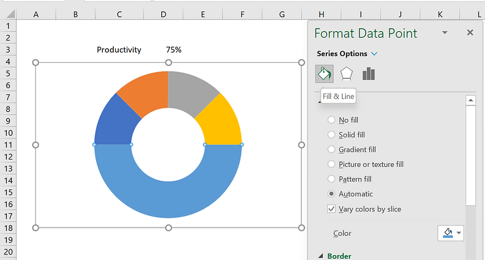
Now, select any one of the series in chart and press Ctrl+1 to open the chart format pane. Since, we selected the data point it will open Format data point option.
In which, change the angle of First slice into 270 degree.

Click any one of the series in chart and again click in the bottom series of the chart, ensure that only the bottom part of the chart is getting selected, Now change the Fill color into No Fill as shown below. Then, click outside of the chart and again click the border of the chart, set the fill color as No fill and Border as No line.

Now, only 4 slice available in Doughnut, select each of the slice and change the colors as sown below.

Now, click on the '+' icon in the top right corner of the chart, hover over the data label option and click on the arrow to select more options.


Uncheck Value and select Category name.
Click on the data label 'Hidden' and click again and press delete.
Click outside the chart and click any of the category name and change the font color to white. Now, we are halfway across the process and the chart will look like the right-side picture at the top.
To prepare the data set for the pie chart, set the needle to 3%, we can adjust that based on the look of our final output. Subtract half of the needle size with before part and subtract the sum of before, needle part from 200% as shown below.

Select anyone cell and press Alt + F1 to insert the default column chart.
Keep the chart selected and from chart design contextual menu click change chart type and then select pie chart. Then click on the title of the chart and press delete. As of now, pie chart will look like the below one on the left side.

Now, click any one of the slices in chart and press Ctrl +1 to get the format dialog box. Since, we selected the data point it will open Format data point pane. In which, change the angle of First slice into 270 degrees. Then, click on the brown color slice in this chart and click again only to select that slice and set the fill color to No fill and, then do the same for blue color slice.
In H8 cell press = and then refer D3 cell, this helps us to get the value of 75% as data label for 3% slice.
Now, click on the '+' icon in the top right corner of the chart, hover over the data label option and click on the arrow to select more options. Uncheck the value and select value from cells option. In the dialog box select the range H7:H9 and press OK. Now, you can see that the data label precisely fits our requirement.
Click on the border of the chart and from the chart format pane, select No fill and No line option.

Select both the charts as shown above, in the Shape format contextual menu, all the way in the right side, you can see arrange group. In which click on the drop down in align option,
click align top and then click align left.
Now you can see that both charts are aligned and looks like a single chart. Then right click and select group option. Hide the data preparations by changing the font color into white and place the chart in your desired place.
Comments