

Step by Step guide to create Bullet chart in excel
- V E Meganathan
- Mar 28, 2024
- 2 min read
Today we are going to discuss about the Bullet chart preparation process in excel.
We can use this chart to show the metrics like, Productivity, Efficiency, Utilization, Customer satisfaction and dissatisfaction. It takes less space in our dashboard compared with Gauge chart or Speedometer chart.
Before diving into the topic, let me show you the requirement and final output.

This requires very little data preparation steps and Chart customization.
Let me start this from scratch,
Prepare the data as shown below,
In D8 cell, refer D2 cell for productivity.

Hardcode all other values and click anywhere inside the data and press Alt + F1 to insert the default chart (Column chart). Select the chart, in the chart design contextual menu, all the way across right, you can see change chart type, click on that. The below dialog box will open, select the 2nd chart type and click OK.

Click on the chart title and press delete and select grid line in chart and press delete.
Now again select change chart type, at the left side pane at the bottom, click on the option "Combo". At the right side, you can see the chart type selection drop down for each series.

Click on the chart type drop down for Productivity change into stacked line and Target series into scatter chart and click OK.
In the format chart area pane, click on the drop down in series option and click Target series (see left side pic at bottom). Click on the Fill option, in the marker section, select 'built-in' marker option. Change the type into flat line and set the size to 20 (see right side picture at bottom).


Then change the fill color based on your preference and select No line for border.
In the chart format pane, click on the drop down for series option and select productivity series. Then in the chart top right corner, click on the '+' icon and check the box for Error bars. Now you can see that format chart area pane changed into format error bars pane.
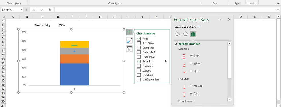
Since, we inserted line chart for productivity, we can get access only Y axis error bar or vertical error bar. In the direction select Minus and for end style select No cap.

In the error amount section, select percentage and set to 100%. Then in the fill option, set the width of error bar to 20 points and change the color based on your preference. Select each series of poor, average, good, excellent and change the colors based on your preference as shown below.

Select the vertical axis and set the maximum value into 100%. Select any of the series and change the Gap width into 100%. From the Chart design contextual menu, click on the select data option, then click on the edit option in Horizontal axis labels. The dialog box will ask for the range, select C2 cell and click OK.

Select the productivity series, click on the + icon, check the box for data labels and from the right arrow option select below. Then change the color of the data label font into white.
Hide the data preparation table by changing the font color into white and move the chart above the data as shown below.


Good information